Contemporary Elegance
Epsom was a classic Charleswood character bungalow, and all it needed was a touch of modern life. A fresh coat of paint on the exterior, a custom painted rustic garage door and some black trim to tie into the interior. By far the largest change to the curb appeal to this home was the replacement of the outdated bow window, I just love the way these custom horizontal windows look on the home.
A Blank Canvas
The backyard was large and primed for a perfect outdoor focused lifestyle. The only repair needed was to have the whole perimeter fence re-posted so it was level and straight again. We knew we wanted a space to lounge, a kitchen, and dining area. With that in mind we designed this two tiered deck large enough to entertain without destroying your ability to enjoy all that grass space.
Open It Up
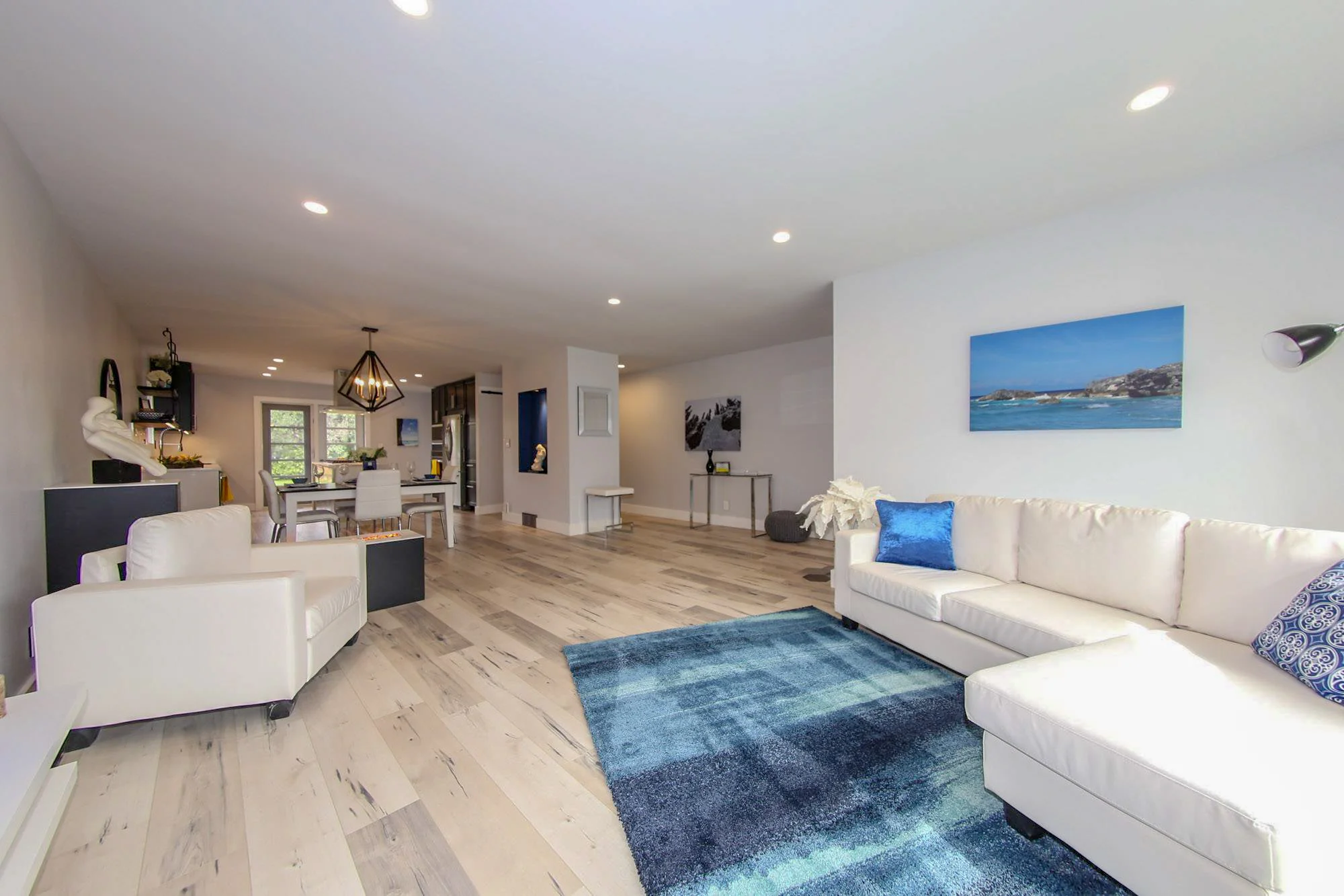
The home upon entry felt cut up, between the sunken living room, the walls and the railing. We raised the floor installed all new lighting and removed the wall separating the kitchen. The window and removal of the built in cabinet updated the space tremendously. We use contrast and subtle transitions to define spaces without inhibiting the flow and sight lines. The custom hexagon tile entryway flows seamlessly into the brand new laminate. The custom black water vapor fireplace helps maintain the desired humidity while breaking up the space without getting in the way. I love the way it looks at night.
Function meets Beauty
We had lots of room to work with here at Epsom for our kitchen dreams. With the wall gone it opened up the ability to have this massive 7 ft x 3 ft island maximizing the countertop space available. A subtle glossy textured geometric pattern on the backsplash will keep it easy to clean and timeless for years to come. A farmhouse style sink was a must in a kitchen this large and the wall of cabinets with your built in appliances is a dream to use. We wanted this home airy so dark stained thick wood floating shelves are a center point for this design. Glass cabinets outfitted with a patterned back in order to add some texture and style to the space. We added some lighting in the cabinets and island drawers. To finish it all off we replaced the bow window with some french style doors to match the living room window and this kitchen was a home run.
A Small but Elegant Oasis
We were limited with how much we could do with the bathroom given the size limitations. This house does feature an ensuite so we reduced the size of the vanity, floated it and put the toilet on an angle to maximize the feeling of space in the room. Massive 4 ft x 2 ft tile in white keep the space bright and big.
Clean and Bright
The master originally didn’t feel like a special place in the home, it had no life to it. The closet was unusually large but not big enough to walk in, and we didn’t want to impede the space in the room itself. We decided to bump out the closet slightly making it semi walk in with a place to mount your tv above the fireplace. A barn door to match the basement doors but in frosted glass for some elegance. Inside the ensuite we removed the tub and flowed the matching tile from the other bathroom throughout. A half glass separation improves your feeling of space.


